-
Notifications
You must be signed in to change notification settings - Fork 288
Windows UI Anniversary Release 2016
Welcome to the Windows Anniversary Release for Windows UI! By now, you've most likely updated your machines with the latest builds and started to check out some of the awesome SDK additions. In this edition, we'll give an overview of some new capabilities that were added to the Windows UI platform this release. Get ready to learn about some of the great new additions that will allow you to use the Universal Windows Platform to build more beautiful and engaging user experiences that bring your app to life!
Transitions in UWAs have traditionally been a bit tricky to get looking smooth and seamless--navigating between pages or resizing the window can often end up feeling a bit jarring. This lack of seamlessness can make it difficult for users to keep context as the content layout changes, or as they navigate between pages. In the anniversary release, we've added a few new animation features to help make seamless transitions easier in the Windows Universal Platform.
Layout animations are the integration between XAML layout and the implicit animations available in Windows.UI.Composition. Implicit animations are trigger-based animations that run whenever their trigger changes. Integrating implicit animations with XAML layout enables you to smoothly animate UI elements when their position updates from changes in the app layout (such as a change in your GridView dimensions due to a window resize). Layout animations are a great way to help users keep track of content while the layout of the app is changing, and they often help your app feel more responsive and dynamic. The gif below shows a quick comparison between enabling and disabling these implicit layout animations.

To learn more, check out these resources:
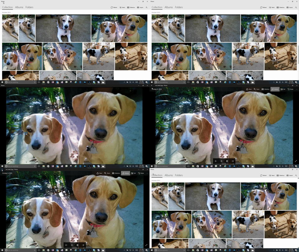
When navigating between pages, it is easy to lose context when there is no sense of continuity between the different views. Adding Connected Animations is a great way to make page navigation feel more seamless and natural while also keeping the user's attention on the most important content. Though this experience was possible to get working last release using Composition APIs, it could be tricky to get setup and integrated with your XAML content. In this update to Windows, the new XAML ConnectedAnimationService provides an easy way to keep elements visible while navigating through the application. The updated Photos app in RS1 is a great example of Connected Animations in action.

To learn more, check out these resources:
Smooth manipulations in UWAs have traditionally been scoped to controls like the ScrollViewer that are built for specific UI patterns. In the Anniversary Release, we've added the InteractionTracker which lets you hook up manipulation information directly into the ExpressionAnimation engine. This connection enables you to build smooth custom manipulations, completely independent of your UI thread. Creating smooth and natural feeling manipulation experiences makes your app feel more engaging and responsive. Taking advantage of the physics-based capabilities of these custom manipulations can also make your app feel more dynamic than ever before.
![]()
To learn more, check out these resources
- Video talks about 2 samples that use InteractionTracker
- InteractionTracker Sample in the Sample Gallery
The new Lights and Shadows added in the Anniversary Release SDK are a great way to bring depth and dimensionality to your app's UI. Animatable Lights and Shadows can help bridge the gap between digital and physical, bringing your app to life by making the user's experience intuitive and playful.
Lighting is ideal for drawing the user's attention so as to bring content into focus. CompositionLights enable you to build polished and differentiated UI with minimal code. The addition of scene-based animatable lights in combination with normal maps also enables you to easily integrate advanced graphics concepts such as the simulation of physical textures into your app's UI.


To learn more, check out these resources
DropShadows are another handy tool to add depth to otherwise flat content. Shadows may be used give the impression of content moving in and out of the plane of the screen, in order to highlight or draw attention to important content. Lights and Shadows, related through ExpressionAnimations, may be used to make more distinguished experiences such as a unique hover effect.

To learn more, check out these resources
- CompositionShadowthat does most of the work for you
- Reference documentation
We heard you loud and clear: Blur is here! As with all effects in the Visual Layer, you now have the flexibility to add animatable Blur to your XAML app (in conjunction with a chain of other effects) to create beautiful UI. Blurring is useful for smoothening or softening an otherwise distracting background and drawing focus to foreground content.

To learn more, check out these resources
Effects have been available in the Visual Layer since our last release, but were not optimized for application to an entire tree of content. In this release, we've added LayerVisual, which enables the application of an effect to all of its children. Now, collections of unrelated content may be uniformly treated with an effect to draw the user's attention to or away from sections of your UI.

To learn more, check out these resources:
Follow us on Twitter: @WindowsUI
GitHub: http://aka.ms/winuilabs
Known Issues: http://aka.ms/winuilabs/ki
Feedback: WindowsUI@microsoft.com
Documentation: Windows.UI.Composition namespace
Click here to register for newsletters from Windows UI