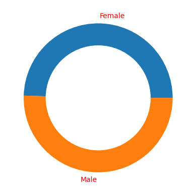
A donut plot (also known as a doughnut chart or donut chart) is a type of chart that displays data in a circular shape, similar to a pie chart. However, unlike a pie chart, the center of the circle is empty, creating a "hole" in the middle, like a donut. ✔️ Kaggle Notebook https://www.kaggle.com/code/pritomsh/donutplot-with-matplotlib for details 💯
# Create a pieplot
plt.pie(values, labels=labels,)
# add a circle at the center to transform it in a donut chart
my_circle=plt.Circle( (0,0), 0.7, color='white')
p=plt.gcf()
p.gca().add_artist(my_circle)# using labeldistance parameter in the pie() function
# Label distance: gives the space between labels and the center of the pie
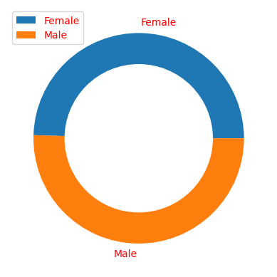
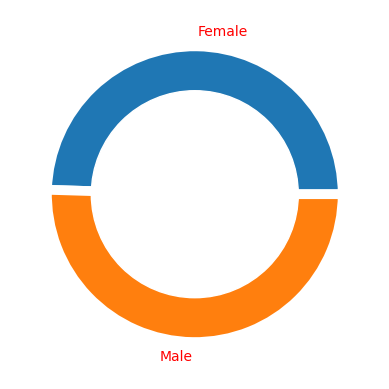
plt.pie(values, labels=labels, labeldistance=0.45)plt.legend(loc='upper left')wedgeprops parameter can be passed to the pie() function in order to set width of the wedge border lines and color:
plt.pie(values, labels=labels, wedgeprops = { 'linewidth' : 7, 'edgecolor' : 'white' })https://www.kaggle.com/code/pritomsh/donutplot-with-matplotlib for details
I would really appreciate it if you could take a time to upvote this notebook if you found it to be useful and instructive. I appreciate your time and thought in advance.


