A package that helps in creating custom Slides and Presenting them.
Note
I am not updating this package anymore. Because, 1. I am not finding time to continue working on this. 2. No one is using this anyway. 3. There is another package that overtook and went ahead, used by many and has all that is in here. So, I suggest if you are looking for something, you should check out flutter_deck.
Use this package to build your presentations with Flutter with ease. Use the pre-built slide widgets or create your custom slide with custom controls and present them by adding the PresentationWidget (provided in this package) to the application tree.
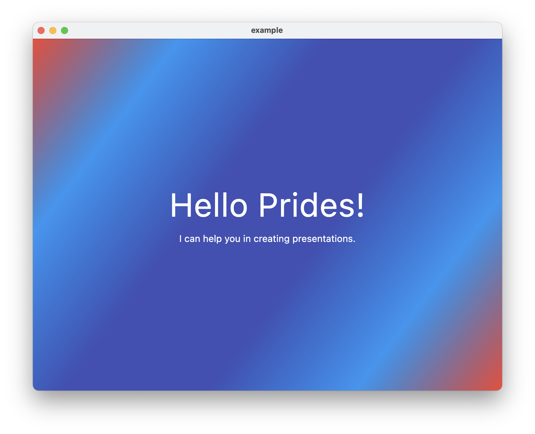
 An example slide built using this package running on macOS
Event controls provided by the widget:
| Event | Advance Slide | Reverse Slide |
|---|---|---|
| Key Event | -> (right arrow) |
<- (left arrow) |
| Tap Event | left 1/3rd Area* | right 2/3rd Area* |
Area*: The area covered by the PresentationWidget
Pre-built slides that can be used directly:
SimpleSlide: removes abstraction of theSlideWidget.TitleSlide: common title slide template containingtitleandsubtitle.SectionHeader: common section header template containing onlytitle.BlankSlide: a slide that only allows option for background widget.CaptionSlide: slide that can be used for captions (left bottom text).
More widgets to come in the upcoming releases.
For detailed usage for these widgets, scroll to the Usage section below.
To start creating slides and present them, add the prides package into your pubspec.yaml file:
dart pub add pridesor
flutter pub add pridesOnce added, you can import:
import 'package:prides/prides.dart';Or follow the instructions provided in pub.dev.
You can start using the package to build your slides. Then, present them with ease.
It is a widget exposed from this package that handles displaying (presenting) the slides and handles the event controls.
The best-recommended method to use:
MaterialApp(
    home: Material(
        child: PresentationWidget(slides: slideList),
    ),
),
slideList is a list of widgets made using SlideWidget. It should contain at least one slide, or else it will throw an error.
We can even specify a common background for all the slides with this widget:
PresentationWidget(
    slides: slideList, // required
    background: BackgroundWidget(),
),
The background widget can be any widget from the flutter framework.
For a single coloured background, you can simply use ColoredBox.
We can even view the current slide number:
PresentationWidget(
    slides: slideList, // required
    showSlideNumber: true,
),
We can customize resolution of slides:
PresentationWidget(
    slides: slideList, // required
    slideSize: SlideSize.standardBig, // 4:3 aspect ratio (16:9 is default when not specified)
),
We can specify how slides fits inside the widget:
PresentationWidget(
    slides: slideList, // required
    slideFit: BoxFit.fill, // defaults to BoxFit.cover when not specified
),It is an abstract class exposed from this package. Extend and implement this class to use in the PresentationWidget.
An example of how to create slides:
class CustomSlide extends SlideWidget {
    const CustomSlide({super.key});

    @override
    Widget slide(BuildContext context) => ForegroundWidget();

    @override
    Widget background() => BackgroundWidget();
}
BuildContext is the context from build of the SlideWidget
If the background returns null, the background passed in the PresentationWidget is considered.
The above is a simple slide that acts in a default way. If you want to create a slide widget to have custom controls to handle states on events, below is an example of it:
// file: listener_example_slide.dart

// initialize the controller
final SlideController _controller = SlideController();

class ListenerExampleSlide extends SlideWidget {
 const ListenerExampleSlide({super.key});

  @override
  Widget? background() => const SizedBox.shrink();

  @override
  Widget slide(BuildContext context) =>
      StateWidget(controller: _controller); // pass controller

  @override
  SlideController? get controller => _controller; // override controller
}

class StateWidget extends StatefulWidget {
  const StateWidget({super.key, required this.controller});
  final SlideController controller;

  @override
  State<StateWidget> createState() => _StateWidgetState();
}

class _StateWidgetState extends State<StateWidget>
  implements SlideControllerListener {
  @override
  void initState() {
    super.initState();
    // attach the listener to the controller
    widget.controller.addListener(this);
  }

  @override
  void dispose() {
    // detach the listener from the controller
    widget.controller.removeListener();
    super.dispose();
  }

  @override
  bool onAdvanceSlide() {
    // handle advance slide
    if (handleAdvance) return true; // stops advance
    return false;
  }

  @override
  bool onReverseSlide() {
    // handle reverse slide
    if (handleReverse) return true; // stops reverse
    return false;
  }

  ... // omitting build method
}SimpleSlide:
SimpleSlide(
    slide: ForegroundWidget(), // required
    background: BackgroundWidget(),
),
TitleSlide:
TitleSlide(
    title: TitleWidget(),
    subtitle: SubtitleWidget(),
),

// Use this constructor if you want to pass only strings
TitleSlide.fromText(
    title: 'Title',
    subtitle: 'Subtitle',
),
SectionHeader:
SectionHeader(title: TitleWidget()),

// Use this constructor if you want to pass only string
SectionHeader.fromText(title: 'Title'),
BlankSlide:
BlankSlide(),

// use this if you want to show a unique background
BlankSlide(background: BackgroundWidget()),
CaptionSlide:
CaptionSlide(caption: CaptionWidget()),

// use this if you want to pass only string
CaptionSlide.fromText(caption: 'Caption'),
You can have a look at the package default example directory that contains an example with detailed usage of the widgets.
API documentation generated for this package is available.
Feel free to open an issue if you face any bugs or have any improvements or new feature ideas.
The package is open-source and can be found in the GitHub repository. Would love if you would like to contribute by opening a PR. PR's are always welcome.


