| jupyter | ||||||||||||||||||||
|---|---|---|---|---|---|---|---|---|---|---|---|---|---|---|---|---|---|---|---|---|
|
Author: Kenneth Wong (kennethwong12.netlify.app)
Last Edited: 2021-10-25
!pip3 install geopandas contextily shapely matplotlibimport geopandas as gpd
import contextily as ctx # for basemaps
from shapely.geometry import Point, LineString, Polygon
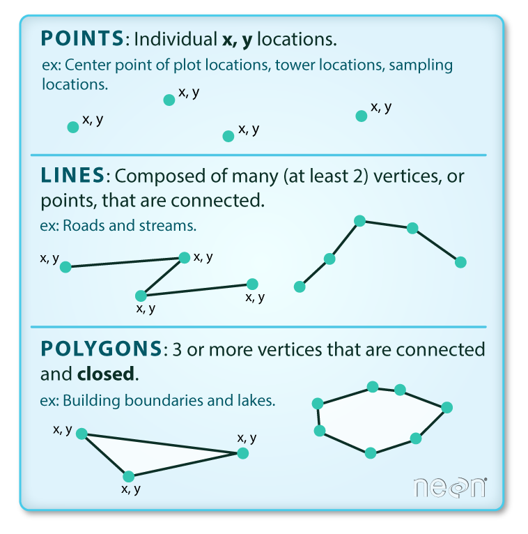
from matplotlib import pyplot as pltIntrinsically, there are 3 vector data types: point, line and polygon.
- Points: Each point is defined by a single x, y coordinate. There can be many points in a vector point file. Examples of point data include: sampling locations, the location of individual trees, or the location of survey plots.
- Lines: Lines are composed of many (at least 2) points that are connected. For instance, a road or a stream may be represented by a line. This line is composed of a series of segments, each “bend” in the road or stream represents a vertex that has defined x, y location.
- Polygons: A polygon consists of 3 or more vertices that are connected and closed. The outlines of survey plot boundaries, lakes, oceans, and states or countries are often represented by polygons.
Read more: https://datacarpentry.org/organization-geospatial/02-intro-vector-data/
For this notebook, we are using data in Shapefile format representing distributions of specific beautifully colored fish species called Damselfish and the country borders of Europe.
We're going to use the wget terminal command to download a file from a url. We then use unzip to unzip the archive into a folder of the same name. The -o option is used to overwrite the folder if it already exists We then us ls to see the contents of the folder.
!wget https://github.com/Automating-GIS-processes/FEC/raw/master/data/DAMSELFISH.zip -O fish_data.zip
!unzip -o fish_data.zip -d fish_data
!ls fish_dataGeopandas (http://geopandas.org/) makes it possible to work with geospatial data in Python in a relatively easy way. Geopandas combines the capabilities of the data analysis library pandas with other packages like shapely and fiona for managing spatial data.
Read more about Geopandas: https://automating-gis-processes.github.io/site/master/notebooks/L2/geopandas-basics.html
Typically reading the data into Python is the first step of the analysis pipeline. In GIS, there exists various dataformats such as Shapefile, GeoJSON, KML, and GPKG that are probably the most common vector data formats. Geopandas is capable of reading data from all of these formats (plus many more). Reading spatial data can be done easily with geopandas using gpd.read_file() -function:
# path to shapefile
filepath = "fish_data/DAMSELFISH_distributions.shp"

# Read file using gpd.read_file()
data = gpd.read_file(filepath)#look at top entries - looks like a pandas dataframe
data.head()data.columnsNote that the data are in (lon, lat) ordering --- this is because the convention is (x, y) for computers, but (lat, lon) for coordinates. This is a frequent cause of error.
data['geometry']# geopandas adds useful attributes to the geodataframe, such as the ability to get bounds
# of all the geometry data
data.bounds# similary, we can get attributes such as boundary
data.boundaryGeopandas provides a useful .plot() function which creates a matplotlib figure and returns an axes object. There's a ton of additional libraries that provide more plotting functionality, and we'll explore a few of them here. There's no "correct" set of libraries to use for GIS in python, and it's up to you to figure out which ones fit the best into your workflow.
The cmap option to the .plot() function allows you to pass in a matplotlib colormap name, which are collections of colors used to visualize data
# we can use the built-in geopandas plot function to visualize
ax = data.plot(figsize = (10,5), alpha = 0.6, cmap = 'Set2')currently the colors are assigned arbitrarily. However, we can also use colors to encode information.
Let's first use colors to categorize by endangerment status. To do so, we pass the column argument to plot(). For reference, we also set legend=True
ax = data.plot(figsize=(10,5), alpha=0.6, cmap='Set2', column='category', legend=True)Another common use of colors to encode data is to represent numerical data in an area with colors. This is known as a choropleth.
Let's use this to encode the areas of each region
#then pass the area column as an argument
ax = data.plot(figsize=(10,5), alpha=0.6, column='shape_Area', legend=True)
The colorbar legend is too big relative to the figure. We'll have to do some manual adjustments. There are tools to create axes grids for colorbars available in:
https://matplotlib.org/3.1.0/tutorials/toolkits/axes_grid.html
from mpl_toolkits.axes_grid1 import make_axes_locatable
fig, ax = plt.subplots(1, 1)
divider = make_axes_locatable(ax) #makes it so you can append to the axes


#put another axes to the right of it, at 5% of the total width with 0.1 points of padding in between
cax = divider.append_axes("right", size="5%", pad=0.1)

# note that you have to specify both ax and cax as arguments for it to work
data.plot(figsize=(10,5), alpha=0.6, column='shape_Area',
legend=True, ax=ax, cax=cax)Contextily is a library for creating basemaps. It pulls data from a host of different basemap providers - see documentation for more details.
ax = data.plot(figsize=(10,5), alpha=0.6, cmap='Set2', column='category')

# now we add a basemap. ctx finds a basemap for a background from
# an online repository.
# It assumes the data is in web mercator (epsg:3857) unless you specify otherwise
ctx.add_basemap(ax, crs = data.crs)
# we can set bounds using matplotlib
ax = data.plot(figsize = (10,5), alpha = 0.6, cmap = 'Set2', column = 'category')
ax.set_xlim([-180,180])
ax.set_ylim([-85,85])
ctx.add_basemap(ax, crs = data.crs)# to look at all of the different providers, check:
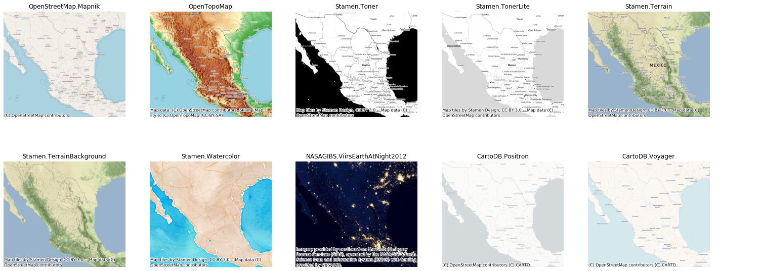
ctx.providersax = data.plot(figsize=(10,5), alpha=0.6, cmap='Set2', column='category')
ax.set_xlim([-180,180])
ax.set_ylim([-85,85])
# to specify the type of basemap, specify the source argument
# the syntax is ctx.providers.{provider name}.{provider style}
ctx.add_basemap(ax, crs=data.crs, source=ctx.providers.Stamen.Watercolor)folium is a Python library for interactive mapping based on leaflet.js.
!pip3 install foliumimport foliumLet’s first see how we can do a simple interactive web-map without any data on it. We just visualize OpenStreetMap on a specific location of the a world.
First thing that we need to do is to create a Map instance
# Create a Map instance
m = folium.Map(location = [22.35, 114.14], zoom_start = 11, control_scale = True)
The first parameter location takes a pair of lat, lon values as list as an input which will determine where the map will be positioned when user opens up the map. zoom_start -parameter adjusts the default zoom-level for the map (the higher the number the closer the zoom is). control_scale defines if map should have a scalebar or not.
Let’s see what our map looks like:
mBASKETBALLCOURT_URL = 'https://geodata.gov.hk/gs/api/v1.0.0/geoDataQuery?q=%7Bv%3A%221%2E0%2E0%22%2Cid%3Afb65b9aa-05d9-4768-a8b1-148072180ba1%2Clang%3A%22ENG%22%7D'
basketball_court = gpd.read_file(BASKETBALLCOURT_URL)The spatial data we just imported needs to be converted to the format where folium understand. (Think of it as converting a video file from .mov to .mp4 such that the video player could play with it)
Now we have our data stored as GeoJSON format, which basically contains the data as text in a similar way that it would be written in the .geojson -file.
basketball_court_gjson = folium.features.GeoJson(BASKETBALLCOURT_URL, name = "basketball court")Add it to the map
# Add points to the map instance
basketball_court_gjson.add_to(m)

mWe can also add a LayerControl object on our map, which allows the user to control which map layers are visible.
# Create a layer control object and add it to our map instance
folium.LayerControl().add_to(m)

#Show map
mLet’s visualize the address points (locations of transport stations in Helsinki) on top of the choropleth map using clustered markers using folium’s MarkerCluster class.
from folium.plugins import MarkerCluster# Create a Map instance
m = folium.Map(location = [22.35, 114.14], zoom_start = 11, control_scale = True)# Following this example: https://github.com/python-visualization/folium/blob/master/examples/MarkerCluster.ipynb
# Get x and y coordinates for each point
basketball_court["x"] = basketball_court["geometry"].apply(lambda geom: geom.x)
basketball_court["y"] = basketball_court["geometry"].apply(lambda geom: geom.y)
# Create a list of coordinate pairs
basketball_court_locations = list(zip(basketball_court["y"], basketball_court["x"]))# Create a folium marker cluster
marker_cluster = MarkerCluster(basketball_court_locations)
# Add marker cluster to map
marker_cluster.add_to(m)
# Show map
m
